Inside Outside
August 2013

As mobile phones get more sophisticated and people use it to do more and access more, they are also increasingly expecting websites to cater specifically to their mobile phones.
A recent Google survey found that seven in 10 mobile phone users want websites to be mobile-friendly but more than 9 in 10 were disappointed. About 75 per cent also say that they are more likely to revisit the site if it is mobile-friendly and five times more likely to abandon what they are doing if the site is not performing optimally.
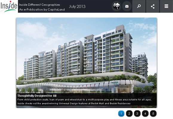
CapitaLand understands this well. That is why they have designed a mobile-friendly version of their e-publication website, Inside Different Geographies.
With this enhanced website, readers can now access all articles about CapitaLand’s architectural landmarks, regional and global highlights and real estate market movements cum trends easily and quickly on the go.
Same Information, Different Layout
The layout of the articles has been adapted uniquely for smartphones and tablets. Since phones screens are generally longer and narrower while computer screens are wider and shorter, the two columns that appear in the regular website have been collapsed into one with the most recent articles appearing first and banners and announcements below.
The bar that allows readers to select the different categories of articles – Home, Spaces, Advocate, People, CapitaDNA, Escape, Gourmet, Style, Investment, Gallery, Archives – is reduced to a single button on the top right.
With one touch, readers can choose from the different categories. For categories that have different themes such as Spaces which is divided into Home, City and Leisure, instead of having to further click on the categories to get to the themes, the top three articles of each of the categories appear the moment you go into that page. This limits the number of clicks it takes to navigate to a page, a feature mobile phone users welcome.
The design is also clutter-free, making reading the articles on a small screen easy.
Easy-to-use features
The website, when accessed from the mobile phone, features big finger-friendly buttons that make the touchscreen interface easy. You can share your favourite article via Facebook, Twitter, Gmail or any other fun platforms.
With this mobile-friendly website, you can access Inside while you are outside. Information on the go just got easier.
Inside Different Geographies is also now on Twitter! Follow us @CL_Inside for more interesting insights and information on the go!